Introduction
Most small and mid-sized business websites look fine, but they don’t bring in leads. The problem isn’t design alone. It’s the lack of conversion focus.
Think about it. You invest in a logo, colors, and layout. But if your website doesn’t get calls, demo requests, or quote submissions, then it’s just an online brochure. A website should act like your best salesperson. It should explain who you help, why you’re different, and what a visitor should do next.
This playbook will show you how to make your website work harder. Each step is simple, proven, and designed for SMBs that want more leads, not just more traffic.
1. Why Many SMB Websites Fail
Let’s start with the bad news. Most SMB websites fail at their main job: conversion.
Here are the most common mistakes:
-
The homepage talks about the company, not the customer.
-
There’s no clear “next step” button.
-
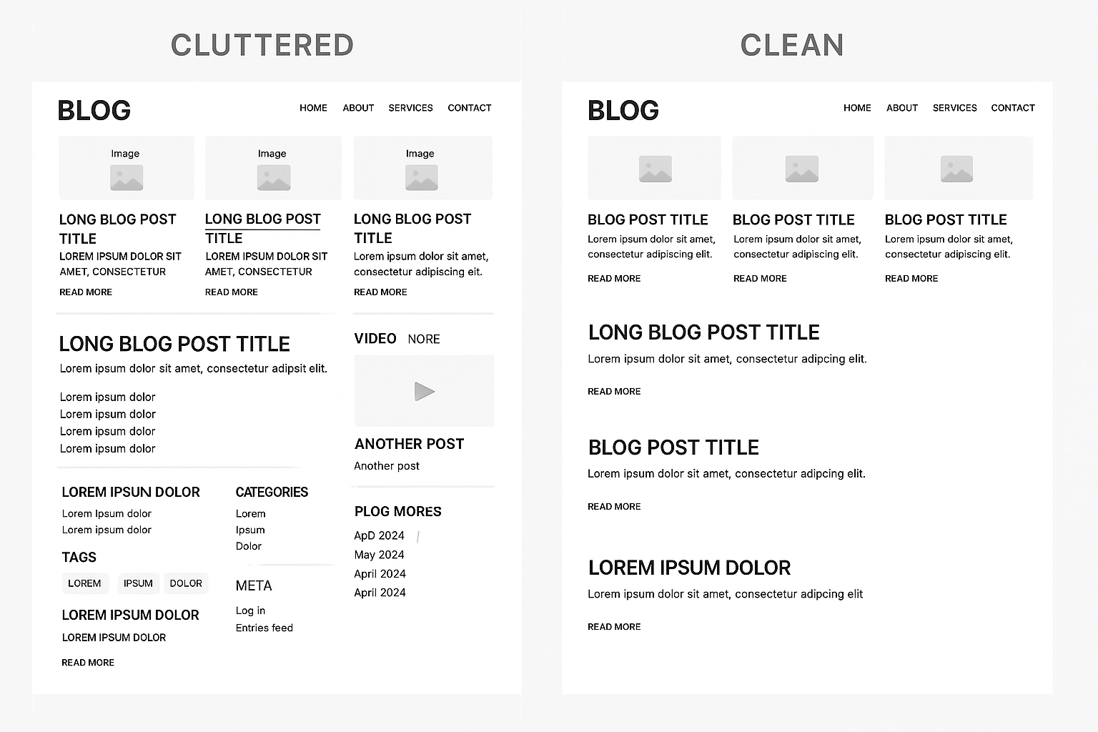
Menus are cluttered with too many options.
-
Pages load slowly and frustrate users.
-
Mobile view is broken or ugly.
-
Stock images look fake and generic.
Case in point: A retail SMB doubled its website traffic after running ads. But they saw zero new sales calls. Why? Their landing page had three different CTAs, none of them clear. Visitors got lost and left.
Checklist – Fix these basics first:
-
Write for the customer, not for yourself.
-
Place one clear CTA on each page.
-
Cut your menu down to essentials.
-
Test speed and mobile view.
-
Replace stock photos with real images if possible.
Explore our Web Development Services
2. Clarity in the First 5 Seconds
Your homepage has five seconds to answer three questions:
-
Who do you help?
-
What problem do you solve?
-
What should the visitor do next?
Most SMB sites fail here. They greet visitors with “Welcome to ABC Solutions. We’ve been in business since 2005.” That means nothing to a prospect.
Better example:
We help SMBs get more leads online. Start with a free homepage check.
Simple. Clear. Action-driven.
Quick test: Ask a stranger to look at your homepage for five seconds. Then ask, “What do we do?” If they can’t answer, you need to fix your headline.
3. Simple Navigation
Confusing menus are conversion killers.
Your navigation should guide, not overwhelm. Stick to 5–7 items at most. Visitors expect to see:
-
Home
-
Services
-
About
-
Resources (or Blog)
-
Contact
Avoid dropdowns stuffed with 10+ links. If you have many services, create one “Services” page with clear sections.
Checklist for clean navigation:
-
5–7 menu items max.
-
Use clear names, not clever ones.
-
Add a sticky header so people don’t scroll back up.
-
Always include “Contact” or “Get a Quote.”
4. Calls to Action That Work
Every page should have one clear purpose. That purpose is the CTA.
Good CTAs are specific:
Bad CTAs are vague or competing:
Case example: A local IT services firm added one bright CTA—“Book Free Audit.” Within three months, their inbound leads went up by 42%.
Checklist for strong CTAs:
-
Place CTA above the fold.
-
Repeat it mid-page and bottom.
-
Use action words like “Get,” “Book,” “Start.”
-
Make buttons stand out with contrast.
5. Landing Pages Built to Convert
A landing page is not the same as your homepage. It’s a focused page built for one ad, one campaign, or one email.
A good landing page does three things:
-
Matches the ad headline exactly.
-
Focuses on one single offer.
-
Cuts out distractions like extra menu links.
Example of a mismatch: You click an ad for “Free SEO Audit.” The landing page headline says “Welcome to XYZ Company, we do marketing.” The visitor is confused. They leave.
Checklist for landing pages:
-
Headline matches the ad.
-
Page has one goal.
-
Remove menus if not needed.
-
Add proof: logos, testimonials, results.
👉 HubSpot’s Landing Page Best Practices
6. Build Trust With Proof
Visitors don’t trust claims without evidence. You need proof.
Ways to build trust:
-
Show client logos.
-
Add testimonials with names and photos.
-
Share short case study highlights with numbers.
-
Use security badges if you take payments.
Case snippet: A B2B services firm added three testimonials on their homepage. Within six weeks, demo requests jumped 20%.
Checklist for proof:
-
Place logos near the top.
-
Add 2–3 short testimonials.
-
Share at least one number that shows results.
7. Speed and Mobile First
Slow websites lose leads. More than half of users leave if a site takes over 3 seconds to load.
Checklist to improve speed:
Mobile is just as critical. Over half your visitors are on phones. If your site looks broken or loads poorly on mobile, you lose half your potential customers.
Checklist for mobile:
-
Test on multiple devices.
-
Make CTAs large enough to tap.
-
Ensure forms are simple and short.
8. Content That Connects
Most SMB websites sound like brochures. They brag about “quality service,” “innovative solutions,” or “best-in-class offerings.” These phrases don’t convert.
What works is direct, customer-focused writing.
Weak copy:
We deliver innovative solutions for clients worldwide.
Better copy:
We help SMBs book more sales calls with simple websites that convert.
Checklist for better copy:
9. Offer a Free Homepage Teardown
People love quick wins. Offering a free homepage review is one of the best ways to get leads.
You don’t need to give away hours of consulting. A simple review works:
This builds trust and gives prospects a taste of your expertise.
10. Putting It All Together
A good SMB website is not about fancy design. It’s about clarity, proof, and action.
Quick recap of this playbook:
-
Start with a clear headline.
-
Keep navigation simple.
-
Use one strong CTA per page.
-
Build trust with proof.
-
Speed and mobile first.
-
Write copy that speaks to customers.
-
Offer something free to start the conversation.
Follow this playbook and your website will stop being a static brochure. It will start being a sales engine that works 24×7.


